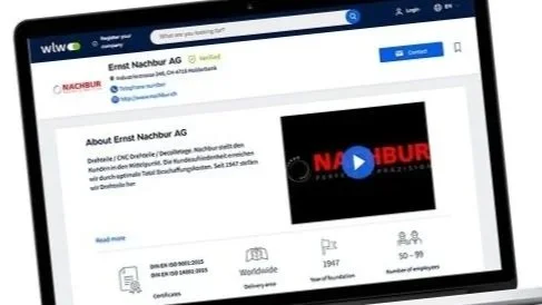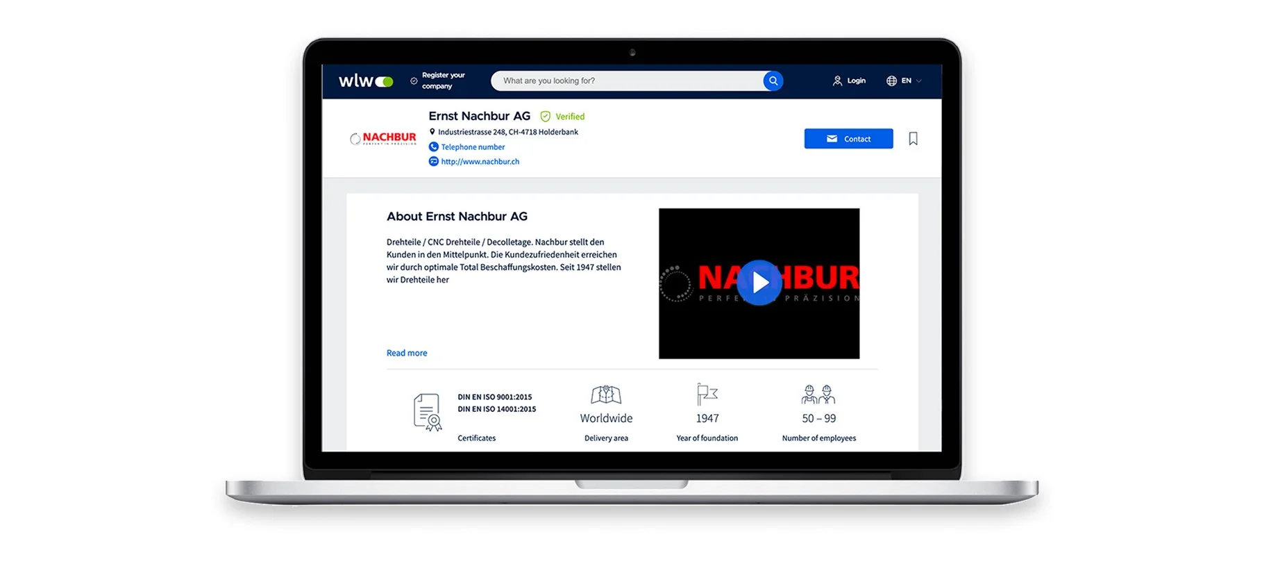
Challenges
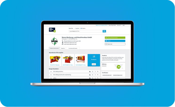
But the old design?
Cluttered, dated, and not mobile-friendly.Outdated UI and inconsistent components
Low mobile usability and visual hierarchy
Key actions buried or unclear (contact, website, product browsing)
Hard for suppliers to effectively represent their brand
Case Study P2
Goals
Human-Centered UX
for B2B
Clean, modern UI with a strong focus on mobile responsiveness
Clear content structure for better scan-ability
Highlight company trust signals and easy navigation
Flexible layout to accommodate varied content.
Case Study P3
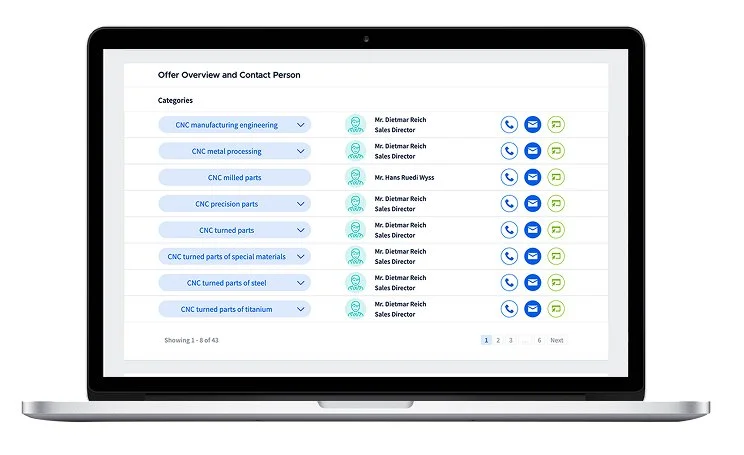
Process
Audit for wlw.de profile page
UX Audit & Stakeholder Input Identified key business goals and pain points based on user research and feedback.
Wireframes & Content Prioritisation Focused on hierarchy: Who you are, what you offer, how to contact.
UI Design & Responsive System Created a modular layout with a clean design system that could scale across the platform.
Developer Handoff & QA Provided annotated UI specs and worked closely with devs to test and refine during implementation.
Case Study P4
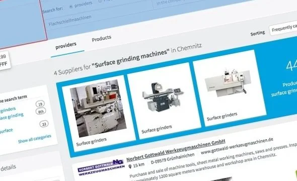
Results | Outcome
wlw.de new list view for profile page
✔️ Cleaner, modern UI
✔️ 100% mobile responsive
✔️ Improved engage-ment with key CTAs
✔️ Flexible layout that adapts to various company profiles
“This redesign made a huge difference. It finally feels like a professional and trustworthy B2B presence.”
Case Study P5
Tools Used:
Sketch, Adobe Suite, Mircrosoft Teams
— UX/UI Design Case Study.
Kelly Jewell