

UX/UI Design
wlw.de & visable.com
Redesigned key user flows and UI for 2 key
European B2B supplier platform to increase
buyer engagement and improve search /
navigation usability.
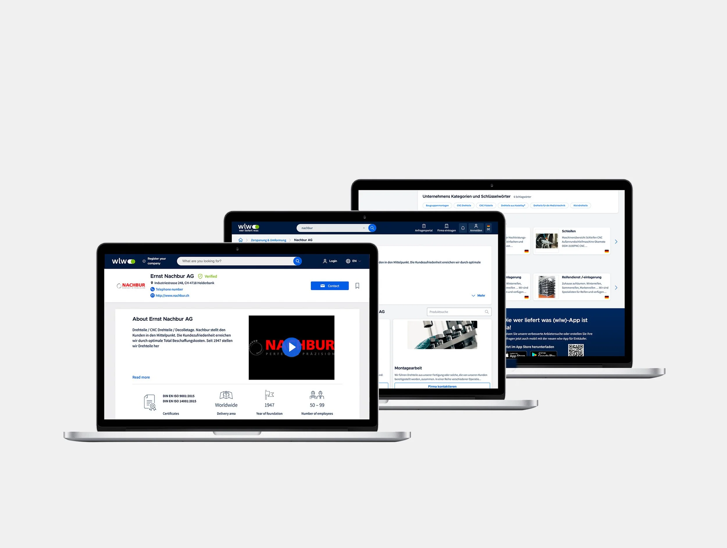
REDESIGN


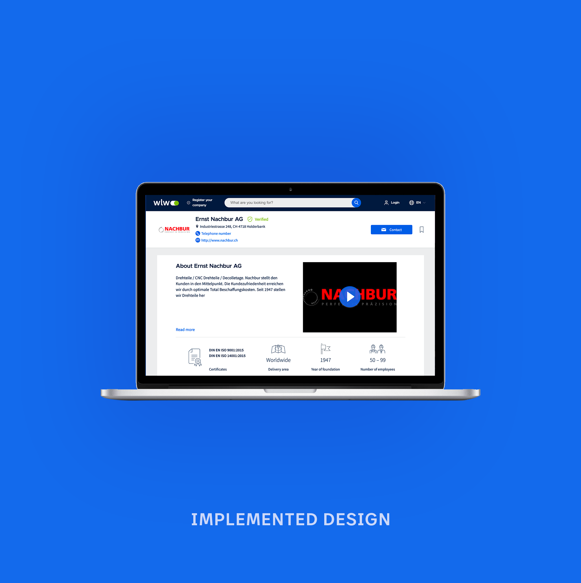
PREVIOUS DESIGN
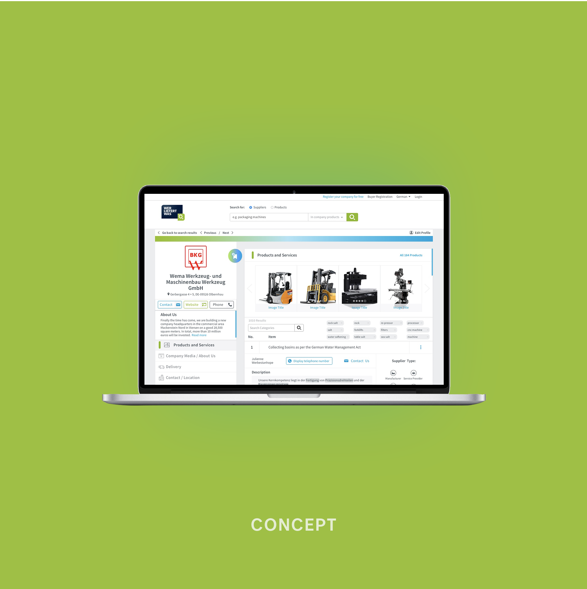
CONCEPT
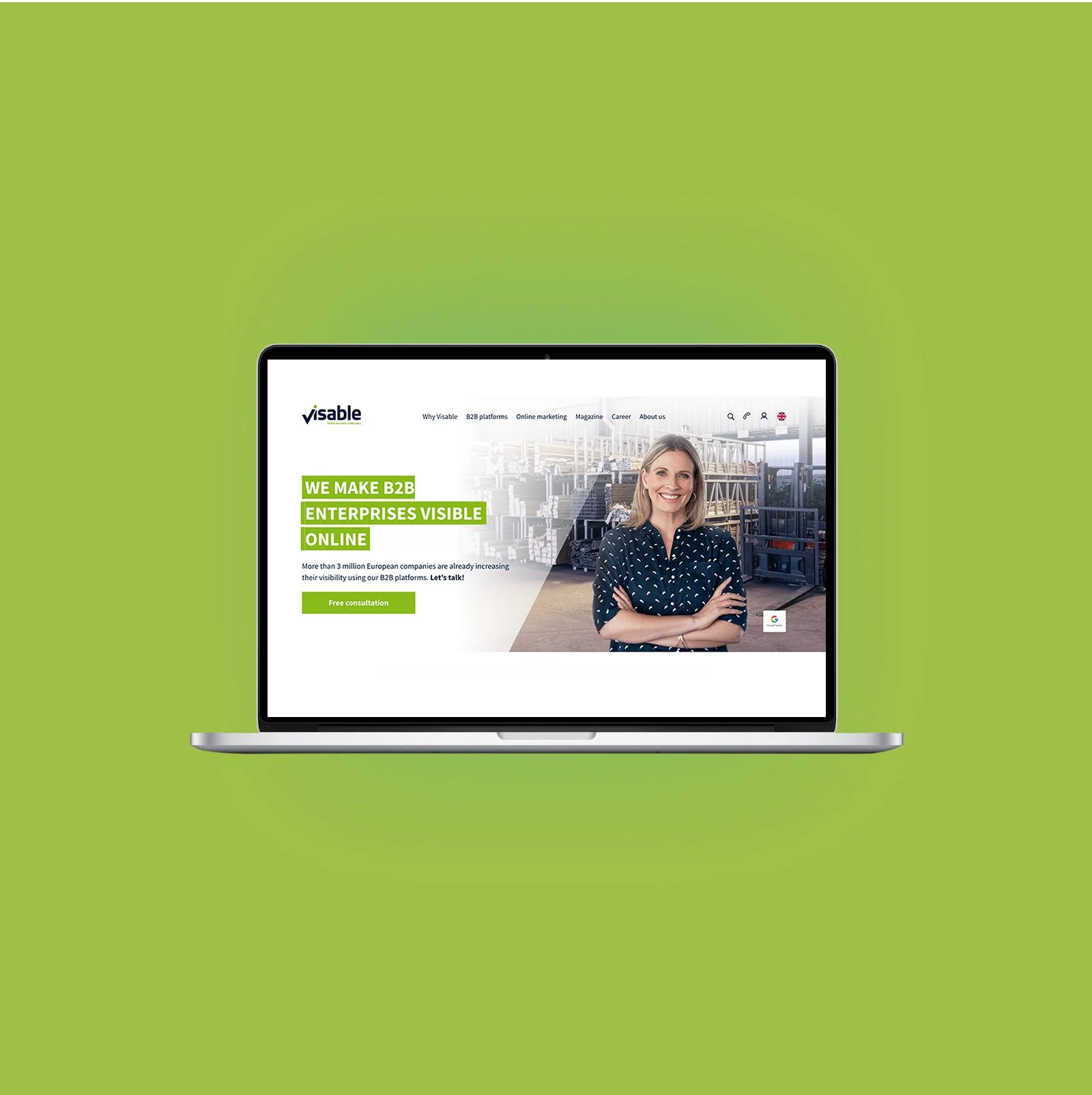
VISABLE.COM HOMEPAGE
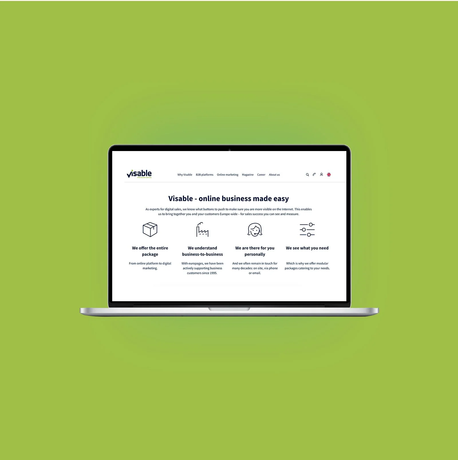
VISABLE.COM SCREEN
About This Project
Role: I worked as a UX/UI Designer for wlw.de and Visable.com, a B2B platforms connecting businesses with suppliers. My focus was improving user experience, site functionality, and creating seamless interactions and UI designs for professionals.
I started with user research and usability testing to identify B2B user needs and pain points, which shaped my design approach. One major project was redesigning the information architecture, making it easier for users to quickly find products and services.
I also improved the advanced search with tailored filters, optimized CTAs, and streamlined the inquiry process to boost engagement and lead generation. By delivering responsive assets to developers, I ensured smooth performance across desktop and mobile. These updates increased satisfaction, reduced bounce rates, and improved conversions.
I introduced and maintained new B2B features through design-thinking workshops, aligning the platform with evolving user and industry needs.
Working as a Team (wlw.de): We analysed how users reached the company profile page - via
1. Search Engine Results Page (SERP): This includes both the unified search and the older search system (while the best approach is still being determined).
2. Direct Access via Google: Users may arrive at the company profile directly from search engines.
3. Product Detail Page: Users navigating through product details can also reach the company profile.
We considered how the visual design aligns across these journeys and whether the appearance of the company profile pages could adapt based on the entry point.
Other Considerations
Stepping back to think strategically about the direction we want to take with the UI, some considerations include:
Should we follow Material Design guidelines in the future?
What would the "ideal" state-of-the-art UI for
wlw.de look like (Work in Progress)?
Our pages were functional but far from perfect,
and aligning on a clear vision might help us move forward more effectively.
Finally, I contributed to broader UI strategy discussions, such as whether to adopt Material Design guidelines and what the “ideal” future UI for wlw.de should look like.